Purpose
This post illustrates how EIOPA’s corporate bond Fundamental Spread tables can be visualised using R. It is structured as follows:
- We introduce the Fundamental Spread, its structure and granularity.
- Then we use the R
openxlsxlibrary to extract selected FS tables from the workbook published by EIOPA at 31 December 2019, and thetidyrlibrary to manipulate this into a more congenial format. - Finally we use the
ggplot2library to produce plots of the FS.
Introduction
In Solvency II, the Fundamental Spread (FS) is the part of a bond’s spread that is treated as compensating for the cost of defaults and downgrades. The remaining yield is available as Matching Adjustment (MA). Insurers with the relevant regulatory approval can capitalise the MA by adding it to the basic risk-free rate and thereby reduce the value of their best-estimate liabilities.
The FS is measured in spread terms (presented for example as basis points). There are two different calibrations, one for corporate bonds, and the other for central government and central bank bonds.
For corporate bonds, the FS is:
- the cost of default, confusingly denoted PD even though it is an expected loss and not a probability of default
- plus cost of downgrades (CoD)
- with the total being subject to a floor of 35% of long-term average spreads (LTAS) to swaps.
There is a second kind of PD (sometimes called PD-prob). This is actually a probability of default, and is combined with a recovery rate of 30% to give cashflow risk-adjustment factors. The two PDs are not derived in a completely consistent manner with each other and the basis points equivalent of the PD-prob combined with the recovery rate is close to but not identical with the PD element of the FS.
The corporate bond FS varies by:
- currency: values for many global currencies are produced, including EUR, GBP and USD
- sector: financial or non-financial
- Credit Quality Step (CQS), a mapped credit rating, from CQS0 to CQS6
- cashflow maturity (sometimes confusingly called duration in the regulations)
For completeness, we note that for government bonds, PD (both kinds) and CoD are zero, and the FS is a proportion of the LTAS to swaps. For EU member states, the proportion is 30% and for other states it is 35%. Negative FS values are set to zero. And the government bond FS varies by:
- country (not currency – central government bond LTAS for different countries within the Eurozone are markedly different)
- cashflow tenor
Data acquisition and processing
The FS is published by EIOPA as a set of tables within an Excel workbook held in a zip file. The zip file for 31 December 2019 is at https://www.eiopa.europa.eu/sites/default/files/risk_free_interest_rate/eiopa_rfr_20191231_0_0.zip.
This is downloaded and unzipped in the working directory using R as follows:
url <- "https://www.eiopa.europa.eu/sites/default/files/risk_free_interest_rate/eiopa_rfr_20191231_0_0.zip"
zip_file <- "eiopa_rfr_20191231_0_0.zip"
download.file(url, zip_file)
utils::unzip(zip_file)
There are four Excel files extracted from the zip file:
list.files(pattern = "xlsx$")

#> [1] "EIOPA_RFR_20191231_PD_Cod.xlsx"
#> [2] "EIOPA_RFR_20191231_Qb_SW.xlsx"
#> [3] "EIOPA_RFR_20191231_Term_Structures.xlsx"
#> [4] "EIOPA_RFR_20191231_VA_portfolios.xlsx"
We want the one with PD_Cod in its name, and load this in using loadWorkbook as follows:
xlsx_file <- "EIOPA_RFR_20191231_PD_Cod.xlsx"
wkb <- openxlsx::loadWorkbook(xlsx_file)
We now have an object wkb that represents the workbook in R. Readers familiar with VBA can think of this as being somewhat like a Workbook object, although the functionality available in the R openxlsx library is much more limited than in VBA. As a very basic example of using openxlsx, we can see the sheet names in R by calling names on the workbook object:
names(wkb)

#>  [1] "Main"           "LTAS_Govts"     "TM_Info"        "LTAS_Corps"
#>  [5] "LTAS_Basic_RFR" "LTAS_Specifics" "FS_Govts"       "EUR"
#>  [9] "BGN"            "HRK"            "CZK"            "DKK"
#> [13] "HUF"            "LIC"            "PLN"            "NOK"
#> [17] "RON"            "RUB"            "SEK"            "CHF"
#> [21] "GBP"            "AUD"            "BRL"            "CAD"
#> [25] "CLP"            "CNY"            "COP"            "HKD"
#> [29] "INR"            "JPY"            "MYR"            "MXN"
#> [33] "NZD"            "SGD"            "ZAR"            "KRW"
#> [37] "TWD"            "THB"            "TRY"            "USD"
#> [41] "ECB_reconst"
Examination of the downloaded workbook in Excel shows that the corporate bond FSs are on sheets named by currency, for example GBP. There are eight blocks of data for corporate bond FSs, four for financial-sector bonds, and four more for the non-financial sector. The four blocks in each sector are:
- the PD-prob (to be combined with the recovery rate to give cashflow risk-adjustment factors)
- the PD element of the FS
- the total FS
- the CoD element of the FS
Each block has 31 rows (a header plus 30 maturities) and 8 columns (a header plus 7 CQSs).
The readWorkbook function reads cells from a workbook object (here wkb). Since we are going to read in multiple blocks of data of the same size and shape, it makes sense to write a small helper function to read in a block first, fix up the column headings and keep track of what the block represents.
We test this out on the first block, which starts in row 10 column 2 (cell B10).
read_fs_block <- function(wkb, sheet, start_row, start_col, item, sector, scalar, row_size = 31, col_size = 8) {
  rows_to_read <- start_row:(start_row + row_size - 1)
  cols_to_read <- start_col:(start_col + col_size - 1)
  res <- openxlsx::readWorkbook(wkb, sheet, startRow = start_row, rows = rows_to_read, cols = cols_to_read)

  # EIOPA store the currency in the top-left, replace with maturity as that's what the column represents
  colnames(res)[1] <- "maturity"

  # Set up column names starting with CQS
  colnames(res)[2:col_size] <- paste0("CQS", colnames(res)[2:col_size])

  # Apply the scalar to all columns but the first
  res[,2:col_size] <- res[,2:col_size] * scalar

  # Add columns to track what currency, item and sector this block is for
  res$currency <- sheet
  res$item <- item
  res$sector <- sector
  res <- res[c((col_size + 1):(col_size + 3), 1:col_size)] # Permute columns

  return(res)
}

# No need to scale pd_prob, but we will scale the items in % to convert them to basis points
test_block <- read_fs_block(wkb, "GBP", 10, 2, item = "pd_prob", sector = "Financial", scalar = 1)

knitr::kable(head(test_block), format = "html", table.attr = "class=\"kable\"") # Look at the first few rows
| currency | item | sector | maturity | CQS0 | CQS1 | CQS2 | CQS3 | CQS4 | CQS5 | CQS6 |
|---|---|---|---|---|---|---|---|---|---|---|
| GBP | pd_prob | Financial | 1 | 0.0000000 | 0.0005000 | 0.0009000 | 0.0023000 | 0.0113000 | 0.0345000 | 0.1588000 |
| GBP | pd_prob | Financial | 2 | 0.0002734 | 0.0010666 | 0.0018983 | 0.0051388 | 0.0244878 | 0.0689617 | 0.2589408 |
| GBP | pd_prob | Financial | 3 | 0.0007281 | 0.0016994 | 0.0030082 | 0.0084572 | 0.0387772 | 0.1019684 | 0.3253810 |
| GBP | pd_prob | Financial | 4 | 0.0013110 | 0.0024005 | 0.0042404 | 0.0122032 | 0.0536319 | 0.1329282 | 0.3720985 |
| GBP | pd_prob | Financial | 5 | 0.0019908 | 0.0031736 | 0.0056027 | 0.0163285 | 0.0686840 | 0.1616724 | 0.4069709 |
| GBP | pd_prob | Financial | 6 | 0.0027496 | 0.0040226 | 0.0071008 | 0.0207871 | 0.0836817 | 0.1882396 | 0.4344784 |
We can now write a further helper function to read in all 8 blocks on a sheet and combine them. This function also manipulates the data to calculate the impact of the FS floor (i.e. the extent to which the FS is more than the sum of PD and CoD).
read_fs_blockset <- function(wkb, sheet) {
  # The spec is a data frame where each row describes where a block starts and what it means
  spec <- data.frame(
    start_row = c(10, 10, 10, 10, 50, 50, 50, 50),
    start_col = c( 2, 12, 22, 32,  2, 12, 22, 32),
    item = rep(c("pd_prob", "pd_bp", "fs_bp", "cod_bp"), 2),
    sector = c(rep("Financial", 4), rep("NonFinancial", 4)),
    scalar = rep(c(1, 100, 100, 100), 2))

  # Loop over all rows of the spec data frame, load in the block for that row,
  # and store the results in a list
  block_list <- lapply(seq_len(nrow(spec)), function(i) {
    read_fs_block(wkb, sheet, start_row = spec$start_row[i], start_col = spec$start_col[i],
                  item = spec$item[i], sector = spec$sector[i], scalar = spec$scalar[i])
  })

  # Stack all the blocks into one long data frame
  res <- do.call(rbind, block_list)

  # Pivot this longer so CQSs are in rows rather than columns
  res <- tidyr::pivot_longer(res, cols = tidyr::starts_with("CQS"), names_to = "CQS")

  # Pivot it wider so the items are column names rather than in rows
  res <- tidyr::pivot_wider(res, names_from = item)

  # Calculate the impact of the LTAS floor, i.e. the extent to which the total FS exceeds PD + CoD.
  res$floor_impact_bp <- res$fs_bp - (res$pd_bp + res$cod_bp)

  return(as.data.frame(res)) # Stick with traditional data frames rather than tibbles
}

gbp_fs <- read_fs_blockset(wkb, "GBP")
str(gbp_fs) # 420 observations from 2 sectors, 7 CQSs and 30 maturities

#> 'data.frame':  420 obs. of  9 variables:
#>  $ currency       : chr  "GBP" "GBP" "GBP" "GBP" ...
#>  $ sector         : chr  "Financial" "Financial" "Financial" "Financial" ...
#>  $ maturity       : num  1 1 1 1 1 1 1 2 2 2 ...
#>  $ CQS            : chr  "CQS0" "CQS1" "CQS2" "CQS3" ...
#>  $ pd_prob        : num  0 0.0005 0.0009 0.0023 0.0113 ...
#>  $ pd_bp          : num  0 4 6 16 81 ...
#>  $ fs_bp          : num  7 24 55 151 251 ...
#>  $ cod_bp         : num  0 0 0 0 0 0 0 0 1 1 ...
#>  $ floor_impact_bp: num  7 20 49 135 170 322 0 6 19 47 ...

knitr::kable(head(gbp_fs, 14), format = "html", table.attr = "class=\"kable\"") # Take a look at the first few rows
| currency | sector | maturity | CQS | pd_prob | pd_bp | fs_bp | cod_bp | floor_impact_bp |
|---|---|---|---|---|---|---|---|---|
| GBP | Financial | 1 | CQS0 | 0.0000000 | 0 | 7 | 0 | 7 |
| GBP | Financial | 1 | CQS1 | 0.0005000 | 4 | 24 | 0 | 20 |
| GBP | Financial | 1 | CQS2 | 0.0009000 | 6 | 55 | 0 | 49 |
| GBP | Financial | 1 | CQS3 | 0.0023000 | 16 | 151 | 0 | 135 |
| GBP | Financial | 1 | CQS4 | 0.0113000 | 81 | 251 | 0 | 170 |
| GBP | Financial | 1 | CQS5 | 0.0345000 | 250 | 572 | 0 | 322 |
| GBP | Financial | 1 | CQS6 | 0.1588000 | 1265 | 1265 | 0 | 0 |
| GBP | Financial | 2 | CQS0 | 0.0002734 | 1 | 7 | 0 | 6 |
| GBP | Financial | 2 | CQS1 | 0.0010666 | 4 | 24 | 1 | 19 |
| GBP | Financial | 2 | CQS2 | 0.0018983 | 7 | 55 | 1 | 47 |
| GBP | Financial | 2 | CQS3 | 0.0051388 | 18 | 151 | 1 | 132 |
| GBP | Financial | 2 | CQS4 | 0.0244878 | 87 | 251 | 0 | 164 |
| GBP | Financial | 2 | CQS5 | 0.0689617 | 247 | 572 | 0 | 325 |
| GBP | Financial | 2 | CQS6 | 0.2589408 | 1019 | 1019 | 0 | 0 |
Now we have all the GBP corporate bond FS data in a single data frame, in which columns hold the different FS items, and rows set out the granularity of these items by currency, sector, maturity and CQS. This is in a sensible format for using with asset data to calculate FS and MA. But it is not ideal for plotting, because ggplot wants ‘fully long’ data, so we pivot it longer again, and retain the items we’re going to plot directly:
gbp_fs_for_plot <- tidyr::pivot_longer(gbp_fs, cols = c("pd_prob", tidyr::ends_with("_bp")), names_to = "item")
gbp_fs_for_plot <- gbp_fs_for_plot[gbp_fs_for_plot$item %in% c("pd_bp", "cod_bp", "floor_impact_bp"),]
gbp_fs_for_plot$item <- factor(gbp_fs_for_plot$item, levels = c("floor_impact_bp", "cod_bp", "pd_bp"))

knitr::kable(head(gbp_fs_for_plot, 12), format = "html", table.attr = "class=\"kable\"")
| currency | sector | maturity | CQS | item | value |
|---|---|---|---|---|---|
| GBP | Financial | 1 | CQS0 | pd_bp | 0 |
| GBP | Financial | 1 | CQS0 | cod_bp | 0 |
| GBP | Financial | 1 | CQS0 | floor_impact_bp | 7 |
| GBP | Financial | 1 | CQS1 | pd_bp | 4 |
| GBP | Financial | 1 | CQS1 | cod_bp | 0 |
| GBP | Financial | 1 | CQS1 | floor_impact_bp | 20 |
| GBP | Financial | 1 | CQS2 | pd_bp | 6 |
| GBP | Financial | 1 | CQS2 | cod_bp | 0 |
| GBP | Financial | 1 | CQS2 | floor_impact_bp | 49 |
| GBP | Financial | 1 | CQS3 | pd_bp | 16 |
| GBP | Financial | 1 | CQS3 | cod_bp | 0 |
| GBP | Financial | 1 | CQS3 | floor_impact_bp | 135 |
We could repeat this for the other currencies, or to loop over multiple workbooks to collate a history of the published FSs, but for now we have enough to produce plots.
Plotting
We’re going to take an iterative approach to working out how to plot this data, to show one possible thought process. Readers who just want to see the final version should scroll to the end.
We assume that readers have a basic understanding of the ggplot2 library – there are many good tutorials online, for example here, here, and here.
We have quite a few variables to display in the plots:
- the value of the FS
- the FS item (PD, CoD, floor impact, all of which are measured in basis points)
- maturity
- CQS
- sector
Each of these variables needs to be mapped to an ‘aesthetic’, which essentially means part of the plot, for example the x-coordinate, the y-coordinate, colour, size, etc. Five variables is quite a lot, so let’s start by simplifying things and selecting a particular CQS and sector, say CQS2 non-financial. That leaves us with 3 variables, which we’ll tentatively map to the x and y axes, and colour.
We also need to decide what kind of geometry to use: lines, bars, points, etc. Since we are decomposing the total FS into its constituent parts, a stacked column chart seems reasonable. This is straightforward to set up using ggplot: we map the aesthetics in the call to aes and use geom_col which defaults to stacked columns.
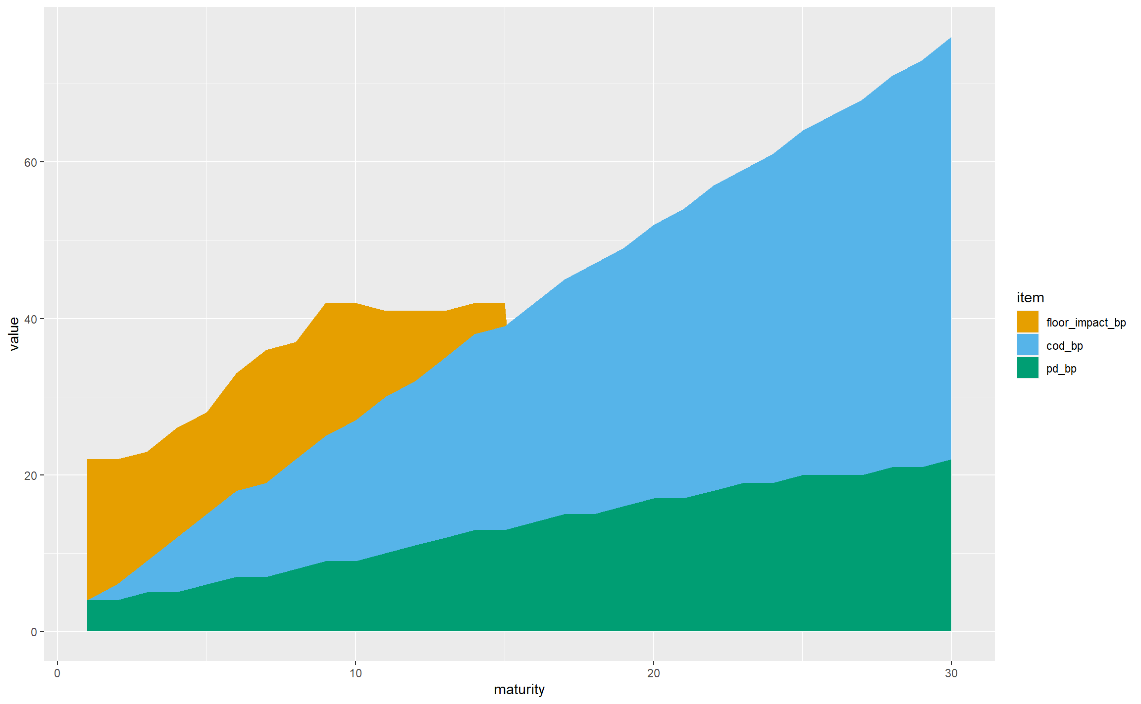
gbp_fs_for_single_plot <- subset(gbp_fs_for_plot, CQS == "CQS2" & sector == "NonFinancial")

ggplot(gbp_fs_for_single_plot, aes(x = maturity, y = value, fill = item)) +
  geom_col()
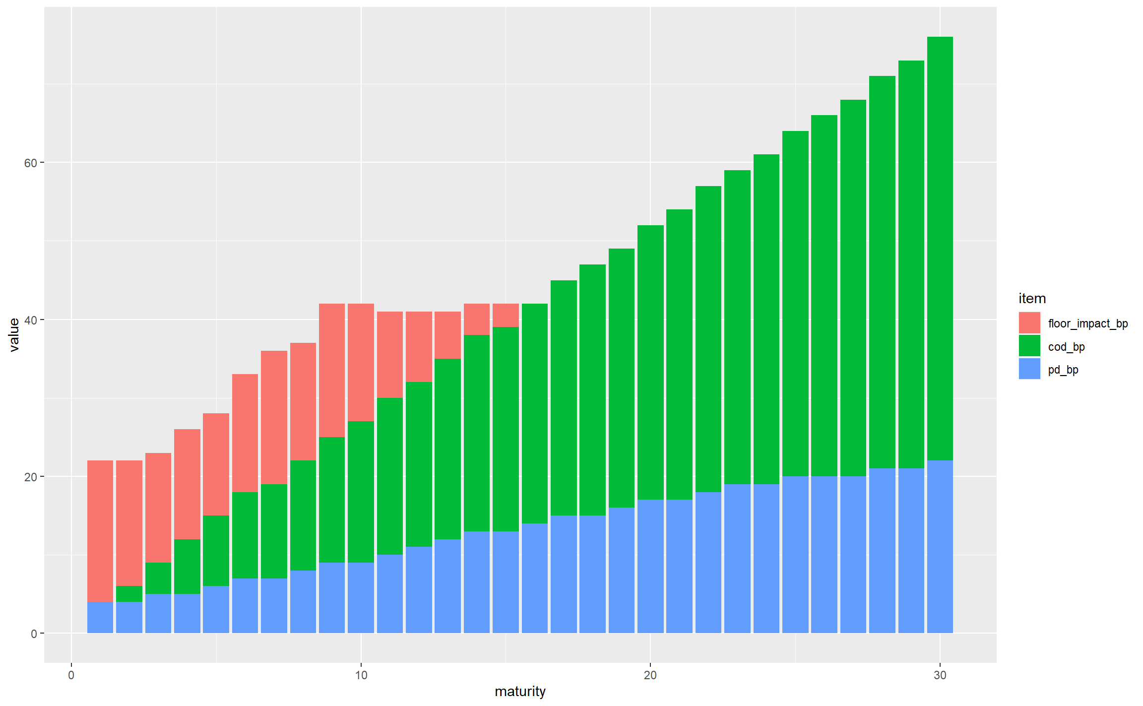
This is off to a decent start; for non-financial CQS2 assets we can see that:
- the total FS varies significantly by maturity, from around 20bps to nearly 80bps
- the PD starts small and rises with maturity, as expected (longer duration bonds have more probability of default, and this outweighs the impact of expressing the resulting expected losses as an annualised basis points value)
- the CoD has a similar general shape, following similar logic (longer-maturity bonds have more downgrade risk even when annualised)
- the floor bites in the first 14 years, but seems to flatten out, and gets overtaken by the sum of PD and CoD at longer maturities
- looking across all maturities, CoD is the dominant contributor
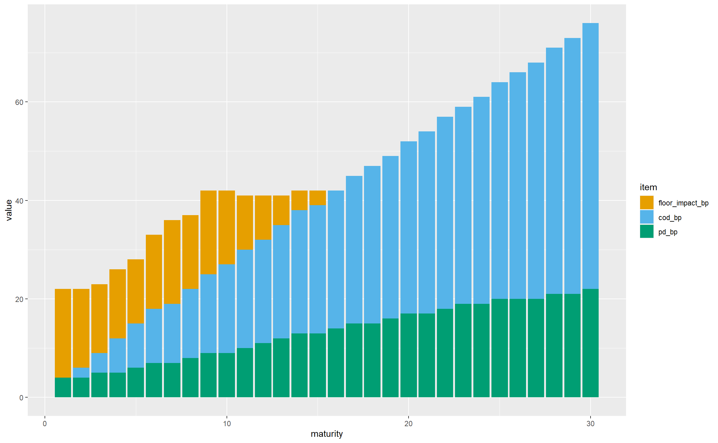
There are a few things to do with tidying up axis titles and so on, but the first thing we should do is choose colours that are visible to colour-blind people – the default red and green colours used by ggplot may not be very distinguishable. Here we’re using the colours put forward by Wong.
safe_colours <- c("#E69F00", "#56B4E9", "#009E73")
ggplot(gbp_fs_for_single_plot, aes(x = maturity, y = value, fill = item)) +
  geom_col() +
  scale_fill_manual(values = safe_colours)
Having dealt with the colours, let’s develop the geometry. There are a lot of columns, so moving to a stacked area chart would be visually simpler, and the key observations can still be drawn:
ggplot(gbp_fs_for_single_plot, aes(x = maturity, y = value, fill = item)) +
  geom_area() +
  scale_fill_manual(values = safe_colours)
Now let’s bring in CQS and sector. This chart is already complicated enough without adding more areas to it, so we’re going to need a different technique. ggplot supports faceting, where the data is split into subsets shown in different panels with the same general structure. Here we are going to facet by CQS and sector, and this is trivial to achieve in ggplot, much more so than it would be in Excel, say:
ggplot(gbp_fs_for_plot, aes(x = maturity, y = value, fill = item)) + # Note using all the data now
  geom_area() +
  scale_fill_manual(values = safe_colours) +
  facet_wrap(~sector + CQS, nrow = 2)
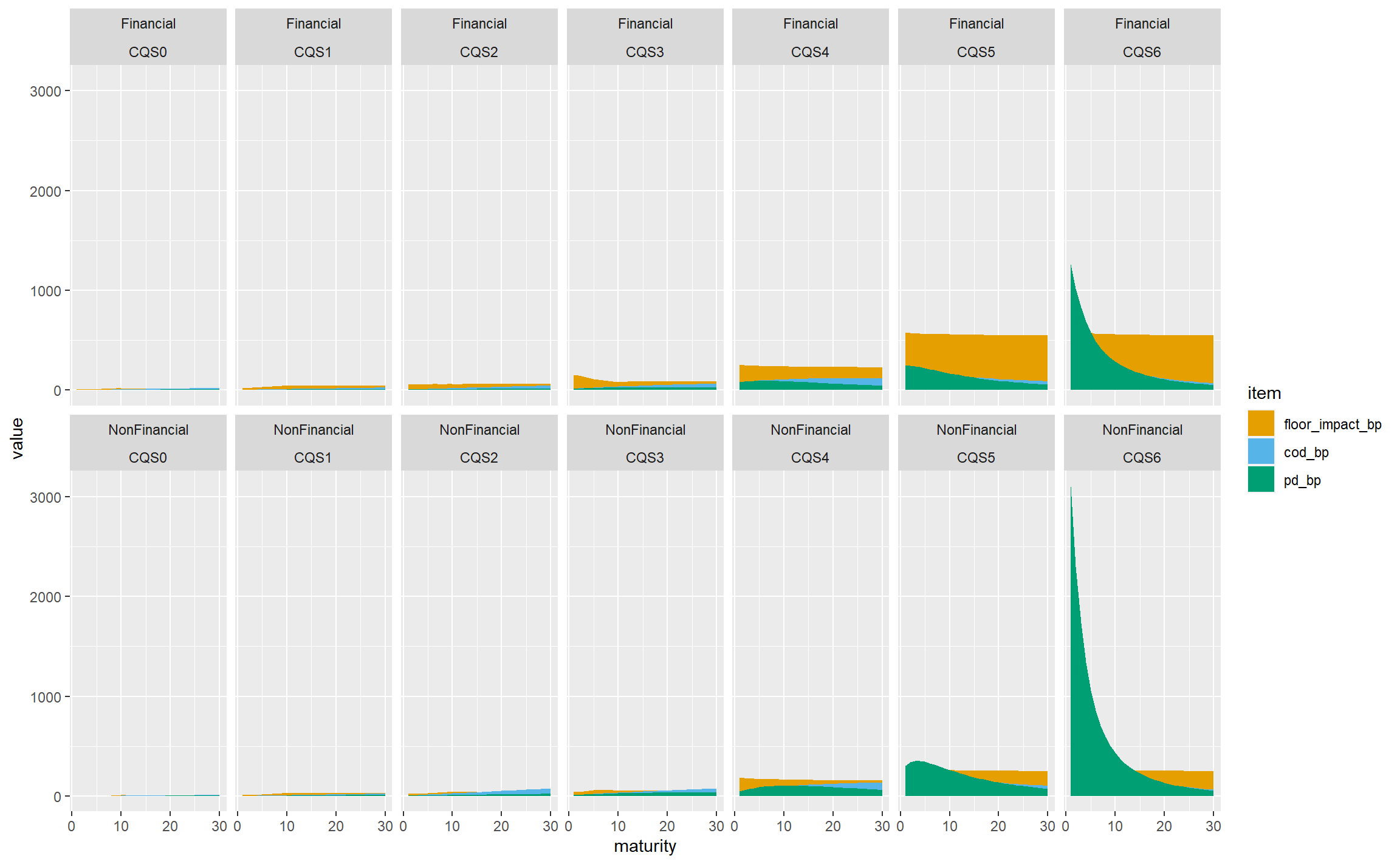
If we’re very charitable, this does achieve the goal of showing all the data and allowing the relationships between CQSs and sectors to be seen, but clearly it is visually dominated by the very large PD for CQS6 non-financial assets, and not much use at all. We can remedy this by allowing the y-axis scales to vary independently on each panel:
ggplot(gbp_fs_for_plot, aes(x = maturity, y = value, fill = item)) +
  geom_area() +
  scale_fill_manual(values = safe_colours) +
  facet_wrap(~sector + CQS, nrow = 2, scales = "free_y")
This is much more informative, at the cost of viewers needing to pay careful attention to the y-axis scales. To pick out just a few observations:
- The floor bites almost all the time for financial sector bonds, and is less dominant in the non-financial sector. We might hypothesise that this reflects the very high spreads seen in the financial sector in the 2008-2009 credit crisis.
- CoD is less dominant for lower-rated bonds (CQS4 and below) as they are already low-quality and the scope for downgrading is less than for higher-rated bonds.
- PD is not monotone with maturity for lower-rated bonds, presumably because the annualisation effect in the basis point values outweighs the increase in the underlying expected losses.
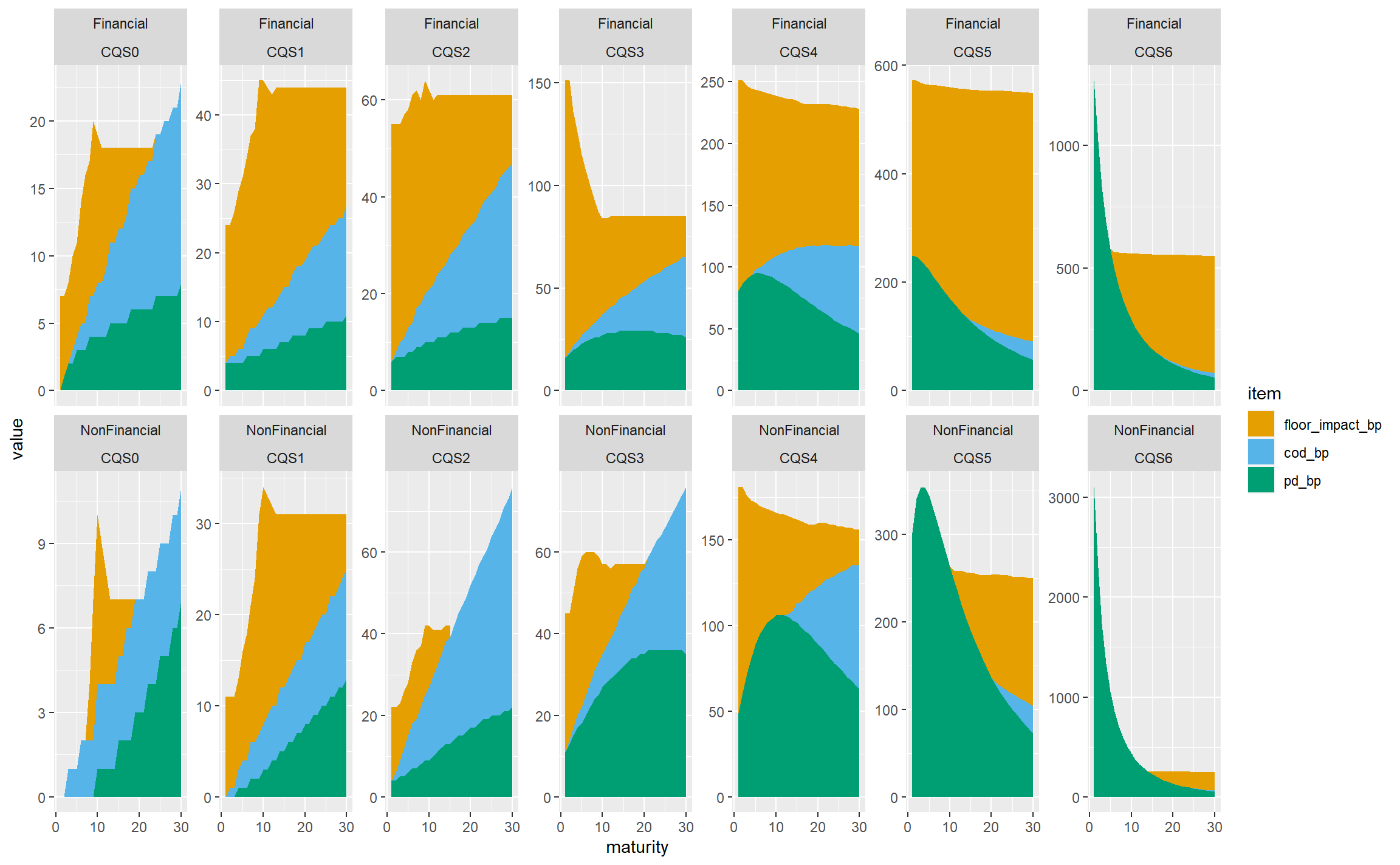
In practice, life insurers don’t hold much in the way of sub investment grade bonds, and we wouldn’t lose that much by restricting the chart to CQS0-CQS3 assets, which gives less for viewers to try to take in:
gbp_fs_ig_only <- subset(gbp_fs_for_plot, CQS %in% c("CQS0", "CQS1", "CQS2", "CQS3"))
ggplot(gbp_fs_ig_only, aes(x = maturity, y = value, fill = item)) +
  geom_area() +
  scale_fill_manual(values = safe_colours) +
  facet_wrap(~sector + CQS, nrow = 2, scales = "free_y")
Let’s try reverting to a fixed y-axis scale, which allows the variability in the total FS across CQSs and sectors to be seen more readily, at the cost of de-emphasising the structure within each panel:
ggplot(gbp_fs_ig_only, aes(x = maturity, y = value, fill = item)) +
  geom_area() +
  scale_fill_manual(values = safe_colours) +
  facet_wrap(~sector + CQS, nrow = 2)
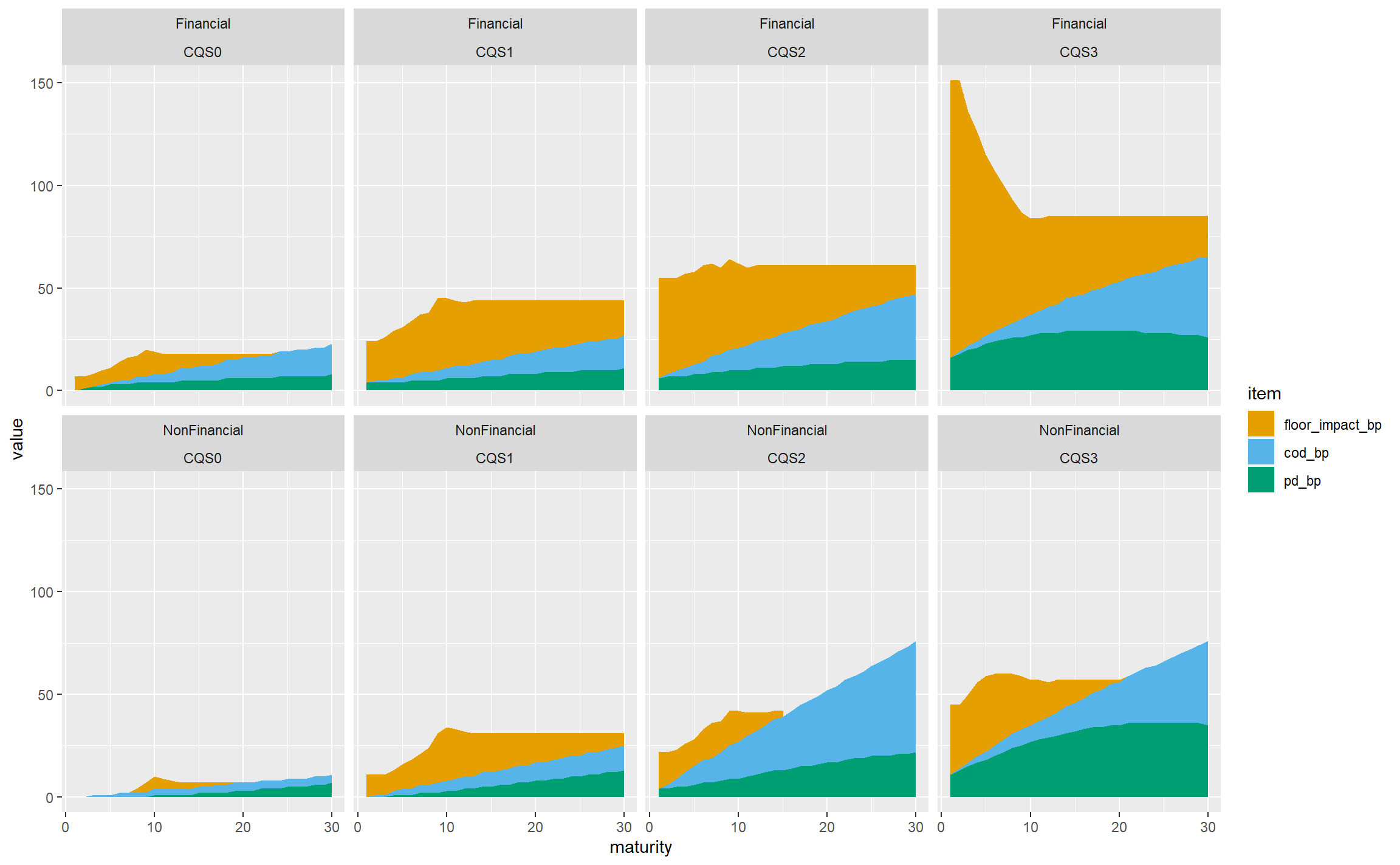
That’s not bad, so let’s stop there in terms of the structure of the plot, and tidy it up a bit.
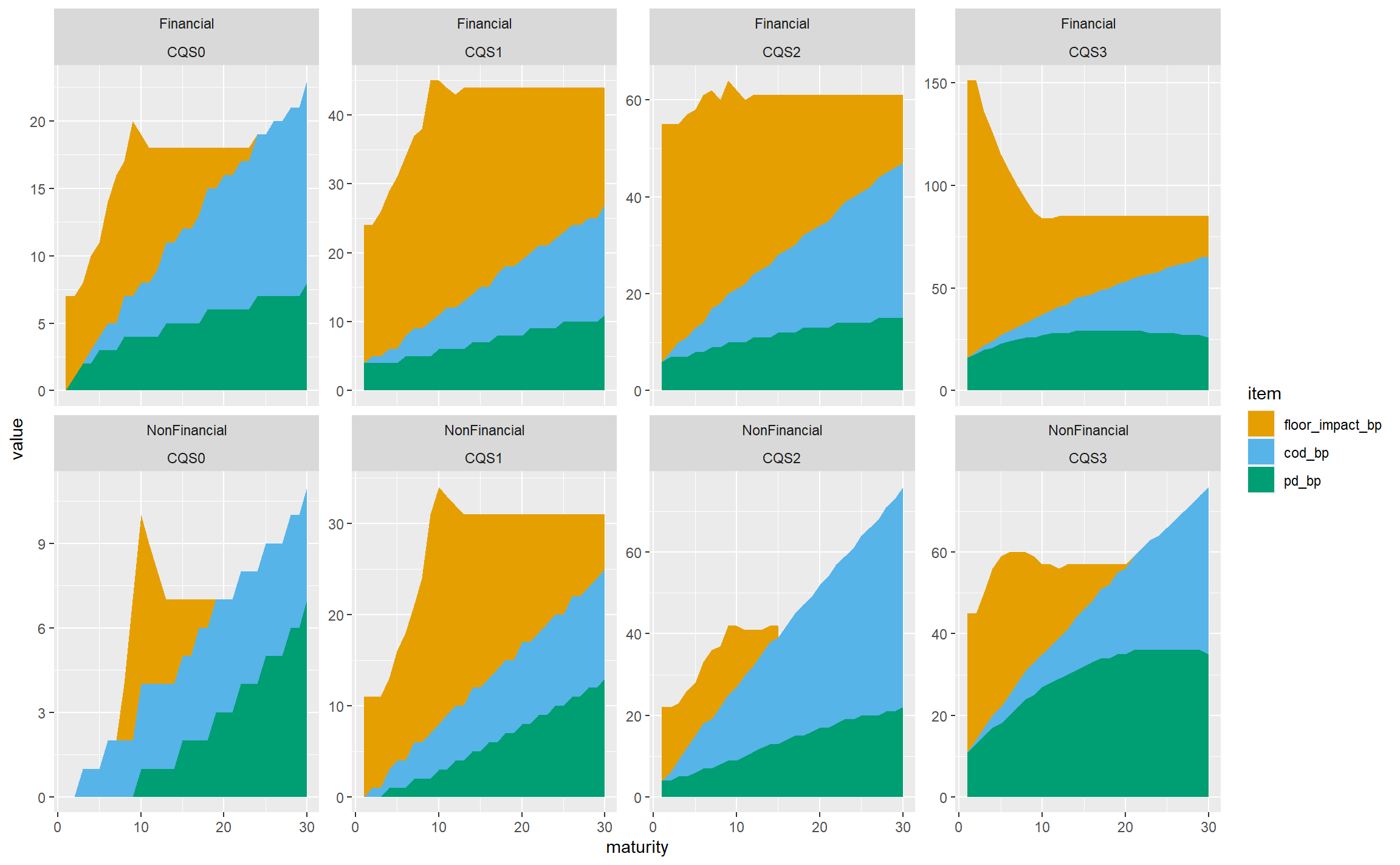
- Since we’re not using free y-axis scales, we can use
facet_gridinstead offacet_wrap. This removes the repetition of the sector and CQS labels. (It isn’t possible to have free scales with facet_grid.) - Add more breaks on the axes: every 5 years on the x-axis and 20bps on the y-axis.
- Add a title, caption and axis titles.
- Remove the title of the legend (‘item’) which doesn’t add anything useful.
- Rename the legend labels to be less technical.
- Change the font sizes to be more readable.
ggplot(gbp_fs_ig_only, aes(x = maturity, y = value, fill = item)) +
  geom_area() +
  scale_fill_manual(values = safe_colours,
                    labels = c("Floor Impact", "CoD", "PD")) +
  scale_x_continuous(breaks = 5 * 0:6) +
  scale_y_continuous(breaks = 20 * 0:8) +
  facet_grid(rows = vars(sector), cols = vars(CQS)) +
  labs(title = "Breakdown of Fundamental Spreads for investment-grade corporate bonds at 31 December 2019",
       caption = "Source: EIOPA") +
  xlab("Maturity") + ylab("FS item (basis points)") +
  theme(legend.title = element_blank(),
        plot.title = element_text(size = 16),
        plot.caption = element_text(size = 12),
        axis.title = element_text(size = 14),
        axis.text =  element_text(size = 12),
        strip.text = element_text(size = 14),
        legend.text = element_text(size = 14))
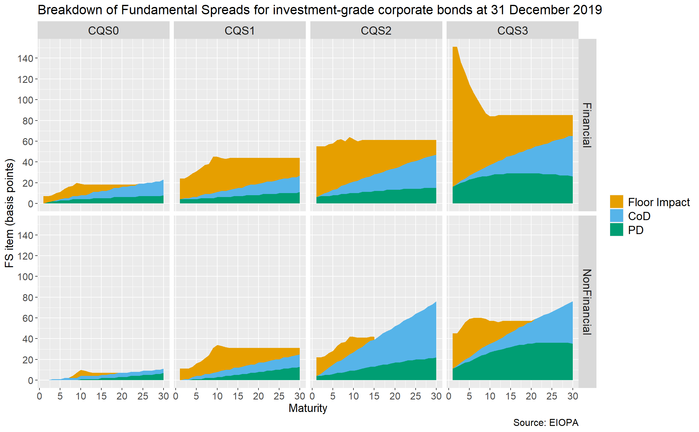
As is often the case with ggplot, the code to tidy the chart up is longer than the code for the overall structure!
Summary
In this post, we discussed the structure and granularity of the EIOPA FS, and showed how to download a particular set of published values and extract this from Excel to R. We then manipulated the data so it could be plotted, and explored different plotting approaches.