Data visualisation can be a very powerful and insightful means of communication. We have considerable experience in this area. For example, in 2014 our principal consultant co-authored a practical guide to data visualisation in the form of a Staple Inn Actuarial Society paper.
The SIAS practical guide was well-received and in part led to the establishment of a working party by the Institute and Faculty of Actuaries. The working party’s output is in the form of a blog containing short case studies of different techniques aimed at scenarios confronting actuarial practitioners.
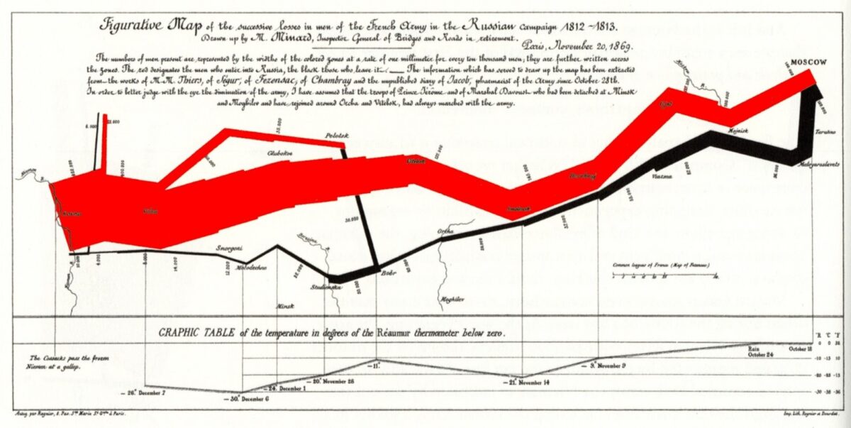
The featured image for this page is Charles Minard’s map of Napoleon’s march to Moscow, showing the terrible losses sustained as the temperature plunged during the Russian winter. This map is discussed further in the SIAS practical guide.